Disclosure: This post may contain affiliate links which could earn me a small commission if you buy something after clicking one. This doesn’t cost you anything and serves to support this site and all of the hard work that goes into it. Thank you for being part of this online neighborhood!
Gallery Walls can be a great way to add dimension to blank spaces – especially in rental homes where we’re often stuck dealing with plain walls and lack of architectural interest. Here are my tips for creating a gallery wall that feels fresh, full of character and never cluttered.
1 | Fewer, Bigger Things
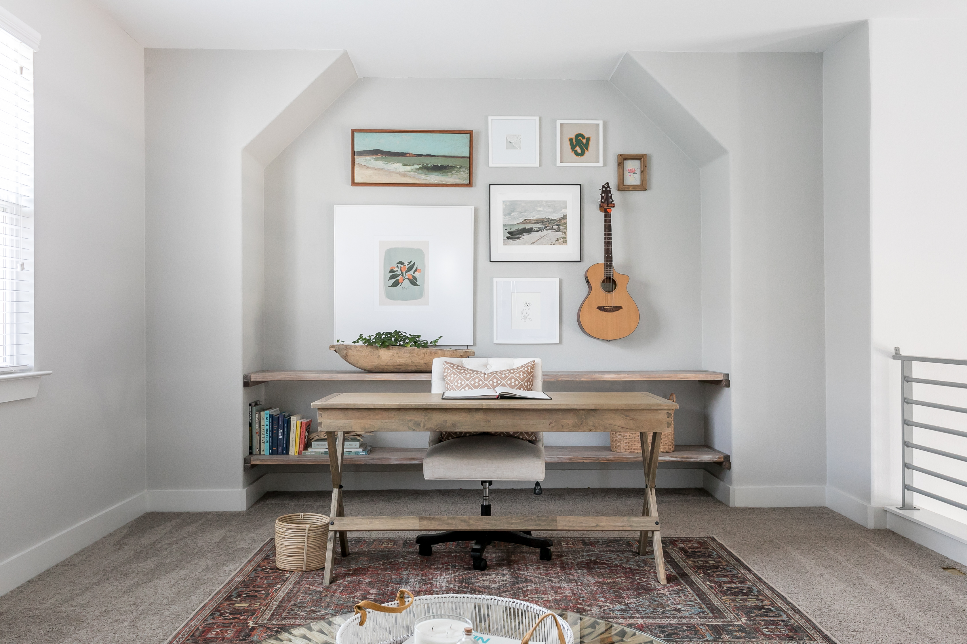
The “fewer, bigger things” mantra is a favorite of mine. All of my favorite interior designs have one thing in common, the designers chose to use only a handful of large scale items to fill a space, thus doubling the visual impact and reducing clutter. You can almost always go bigger than you think. So my approach to a gallery wall is the same. I love using over-sized pieces in a gallery because they create tons of impact without the clutter. The largest piece on this wall is 36″ x 36″ and I covered the entire space in only 8 pieces.
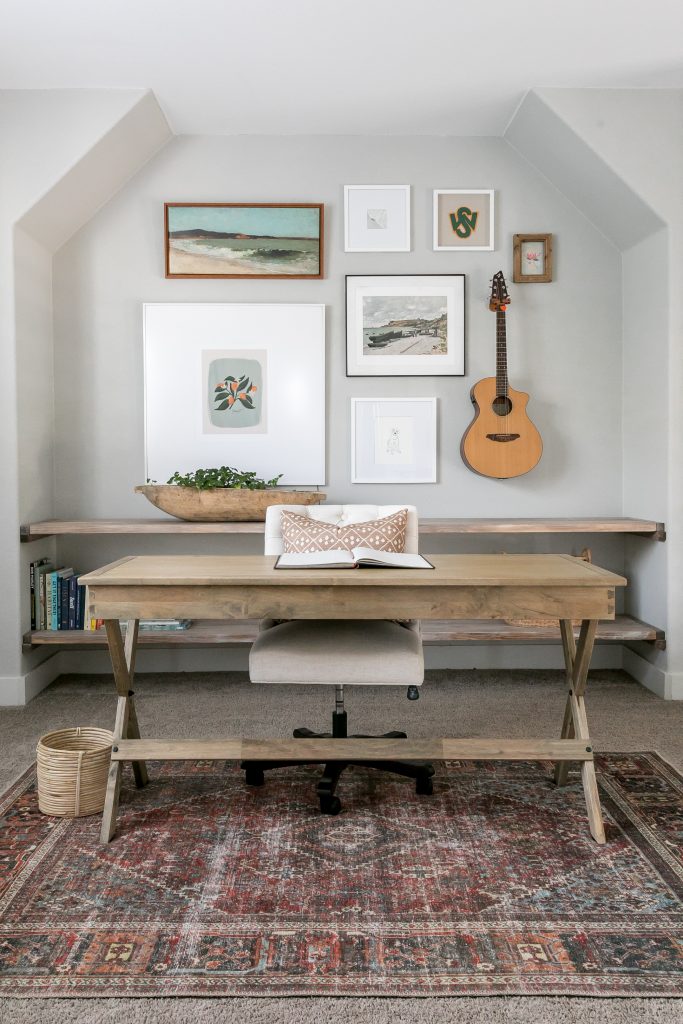
Photo by Sarah Natsumi Moore
2 | Give it some soul
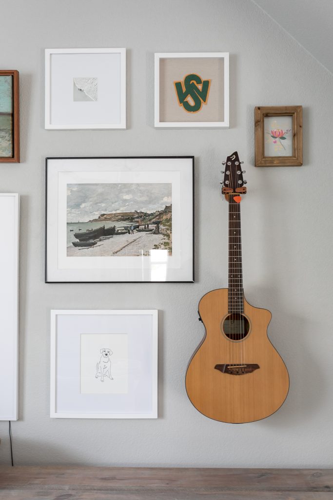
I totally understand the urge to run out to the hobby store and buy a bunch of cutesy objects to fill space but my favorite galleries have a bit of soul to them. Set the foundation with family keepsakes, old photos, art that really speaks to you – or even a favorite instrument! Don’t have your own keepsakes? Etsy is a great source for inexpensive flea market finds that still feel unique.

3 | Grid vs. Free Form
There are infinite ways to hang a gallery wall but if I had to pick two main categories it would be grid vs. freeform.
A grid pattern means you hang identically sized pieces in rows and columns of the same width and height. Grids are symmetrical and symmetry is naturally calming. Thus, grid layouts works well in places like the bedroom where you want to keep things feeling peaceful.
Additionally, when things are symmetrical, the eye isn’t naturally drawn to any individual object in particular. Instead, the gallery wall is almost viewed as one cohesive piece of art. This makes grid gallery walls great for a series of similar objects or images (i.e. a series of black and whites from the same event or maps of cities you’ve lived in) because the viewer will still get a sense of the overall theme without forcing their eye to see the details.

Free form layouts have a bit more flow to them and can be hung in a way that allows the eye to travel around and take in each individual piece. These are great if you have lots of unique and meaningful items that you really want the viewers to notice.

(Tip: In asymmetrical hangings, the channels that run between each piece should be roughly the same width to keep things feeling cohesive.)
4 | Stay Balanced
Another way to reduce visual clutter is to make sure you’re keeping things balanced. First, consider the “weight” of your objects. Spread out your bigger, bulkier objects so that they are evenly spaced around the wall.
On this wall, I have my largest piece (the 36″x36″) on the left and my bulkiest piece (the guitar) opposite of it on the other side of the wall. (Hint: heavier/larger objects generally work better toward the bottom of the gallery.)

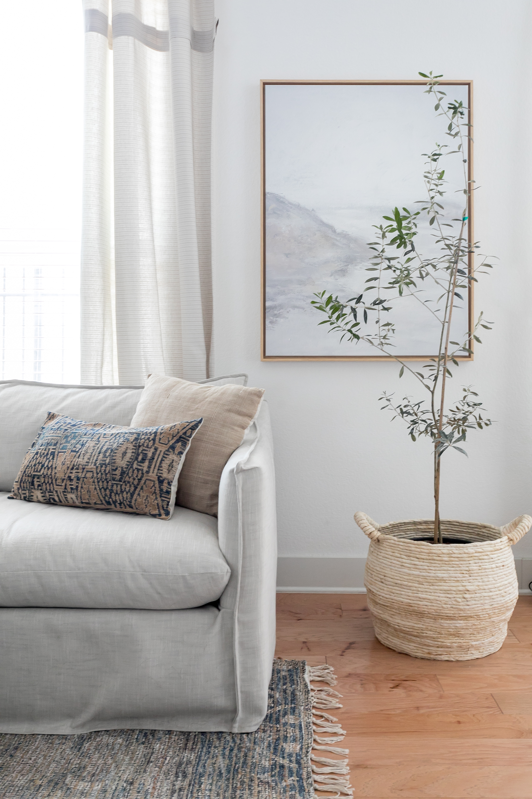
Second, if you’re using various frame finishes or materials, alternate them throughout. Much like the gallery wall below, I stuck to only three different frame colors and varied them to keep things feeling balanced. (Also, notice how they use the window as part of the gallery. This is a creative way to balance out an asymmetrical space.

5 | Choose Your Common Colors
If you look closely, you’ll notice that most of my pieces share two common colors: green and orange. Each piece might have a different shade or be in a totally different genre of art, but having some common colors makes them look like they were meant to be together. Choosing common colors really gives you a ton of freedom to mix styles and mediums.

Ready to make your own? I’ve linked all of my gallery wall pieces below to help you get started. Hover over the photo and click the “+” for info.
Let’s be neighbors! Follow me on Instagram @goldcoastcanvas for more home decor conversations.

Related Posts
Our New Home!
An entire year later, we are FINALLY in our new home. A wonderfully loved fixer…
December 23, 2020Affordable Curtains: Three Options
Though it never gets very cold here in Palm Beach, I still enjoy swapping in…
November 16, 202013 COMMENTS
Leave A Comment
This site uses Akismet to reduce spam. Learn how your comment data is processed.
© 2020 gold coast canvas. all rights reserved.


Our 5-year Renovation Plan | gold coast canvas | 4th Jan 21
[…] now and need a much more functional space (though, it’s still going to have a killer gallery wall!) We also prioritized finding a home with larger dining and living areas to accommodate our big […]
Kesha | 21st Dec 20
Would love to know your frame sizes! I see that the bigger one is 30×30 , but what are the other? Thanks
admin | 4th Jan 21
Good question! Many are custom: The largest is 36″ square, the landscape is 14″ x 31″, the black metal frame is 23″ x 20″, the shadow box (with the high school letters) is 12″ x 12″, the wood frame holds a 5×7 and I believe the white frames are 16″ square and 13″ square 🙂
Copy that: Guest Room for Less | gold coast canvas | 10th Sep 20
[…] First, I wanted to mix textures and patterns in this room and didn’t want the art to compete with them. An extra wide mat tones down any art piece and really allows you to get away with mixing styles. (Try it in a gallery wall like this one here!) […]
Austin House | gold coast canvas | 2nd Jul 20
[…] by Sarah Natsumi Moore | see our gallery wall up close here Turn on your JavaScript to view […]
Elfriede Brase | 14th May 20
Saved as a favorite!, I love your blog!
Loida Seals | 12th May 20
tҺe website іѕ really good, I really like your blog!
Rufus Rusche | 10th May 20
Bookmarked!, I really like your web site!
admin | 10th May 20
Thanks so much!
Kelsey Reust | 27th Jun 19
I’m always so happy to see your custom pup drawing in your gallery wall displays that you got from Scenic Route Shop. I did want to note that custom orders are available on the Etsy shop at https://www.etsy.com/ScenicRouteShop/listing/681082247 in case any of your followers would also want a custom drawing of their pup too 🙂
admin | 2nd Jul 19
Hi Kelsey! Thanks SO much! Your drawing is a favorite of mine. I’ll be sure to let everyone know that they can have one created just for them as well!
Best,
Dani
KellyAnn Baptiste | 9th Jan 19
Such great tips Dani! I love the gallery wall you created and the subtle yet impactful colors! I’ve been considering a grid gallery wall for sometime now but have yet to pull the trigger but you’ve left me inspired to tackle it!
admin | 10th Jan 19
Thank you so much, Kelly! I’m glad this inspired you! love everything you do – I am looking forward to seeing your wall when you’re done 🙂