I’ve put together a room-by-room paint guide that includes info on all of our walls, trims and even painted furniture.
Disclosure: This post may contain affiliate links which could earn me a small commission if you buy something after clicking one. This doesn’t cost you anything and serves to support this site and all of the hard work that goes into it. Thank you for being part of this online neighborhood!
Click a room to jump to it!
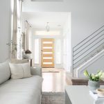
Entry
Walls: Custom (See formulas at end of post)
Trim: Custom (See formulas at end of post)
Our entry walls and trim are both custom formula by Sherwin Williams. Since these formulas are used on many walls in our home, I’ve shared the exact formulas in one place at the end of this post.
The walls are a true white with no undertones. The trim reads a tad grey in comparison. These colors play really well in the bright, natural light of this space. I would use them again.


Living Room
Walls: Custom (See formulas at end of post)
Trim: Custom (See formulas at end of post)
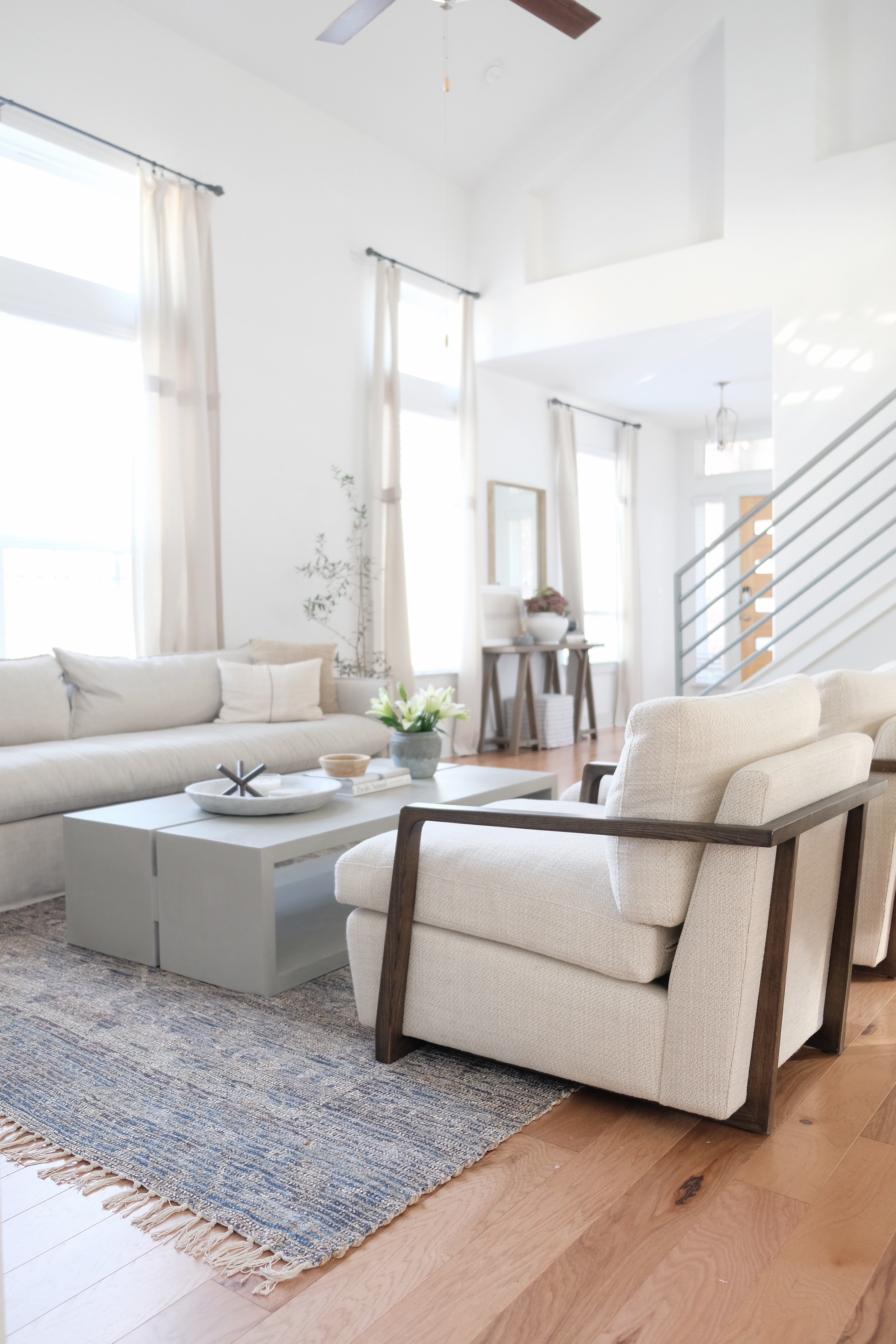
Coffee Table: Fossil Gray Chalk Paint by Behr Paint (finished with Behr’s clear wax but I would suggest something more durable.)
The pure white of the walls in here look extra crisp in the bright, natural light. I think it’s a great option for common areas and it gives you tons of flexibility in your decor because it does not have any undertones. I would definitely use this wall color again.
The coffee table color is one of my new favorite greys. It is rich and warm but still very soft and versatile. It adheres well (I did not sand the console first) and has great coverage without needing any primer. This table used to be dark brown and two coats were plenty. You may not need as much as you think.

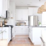
Kitchen & Dining
Walls: Dolphin Fin by Behr Paint, in flat
Trim: Custom (See formulas at end of post)
Our kitchen gets lots of natural light so Dolphin Fin seems to work well in here. It gave the room some much needed depth and contrasts nicely with all of the white cabinetry. I would not use this color in spaces with less natural light because it has very cool undertones.


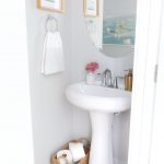
Half Bath
Walls: Dolphin Fin by Behr Paint, in Flat
Trim: Custom (See formulas at end of post)
Personally, I don’t think Dolphin Fin reads well in rooms with low or no daylight because of it’s cooler green undertones. The photo below was taken with reflected light and at a low shutter speed so it might look OK here, but in real life, this windowless bathroom feels cold and drab. If I could do this space over again, I’d opt for a grey with warmer undertones or even a darker color since they tend to read better in darker rooms.

Laundry Room
Walls: Custom (See formulas at end of post)
Trim: Custom (See formulas at end of post)
This room gets tons of light and the white feels extra crisp and clean. I would use this color again in my brightest rooms.

Master Bedroom
Walls: Silver Drop by Behr Paint, in Flat
Trim: Custom (See formulas at end of post)
Silver Drop is often considered the warmer-toned alternative to Dolphin Fin. The name “silver” is very misleading because this is quite a warm grey and can read almost as a beige. We used it in our bedroom which gets tons of natural light all day long. I think it was the absolute perfect choice and I will likely use it again in our next house.


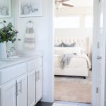
Master Bathroom
Walls: Custom (See formulas at end of post)
Trim: Custom (See formulas at end of post)
If our bathroom were any darker, I probably would not have gone with white in this space (white can look drab in darker spaces.) I think it works in here, however.

Office
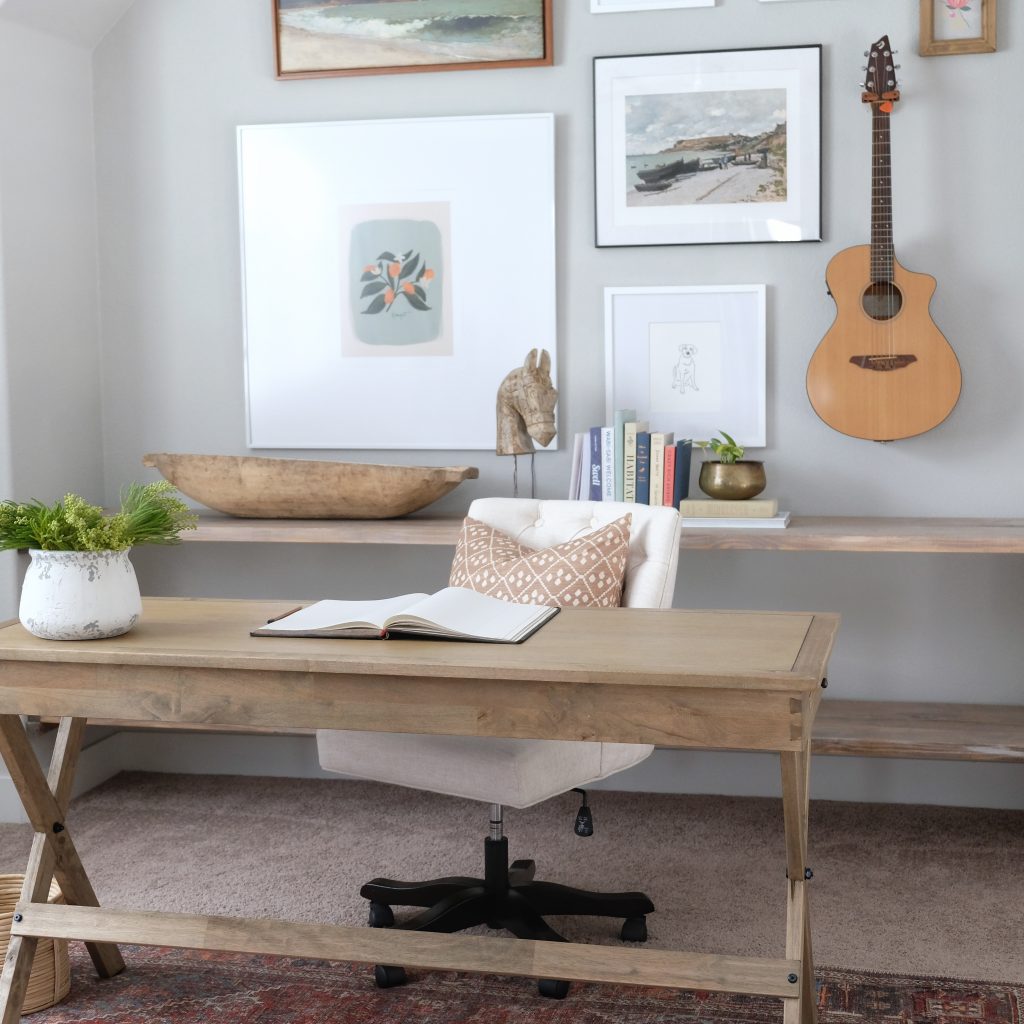
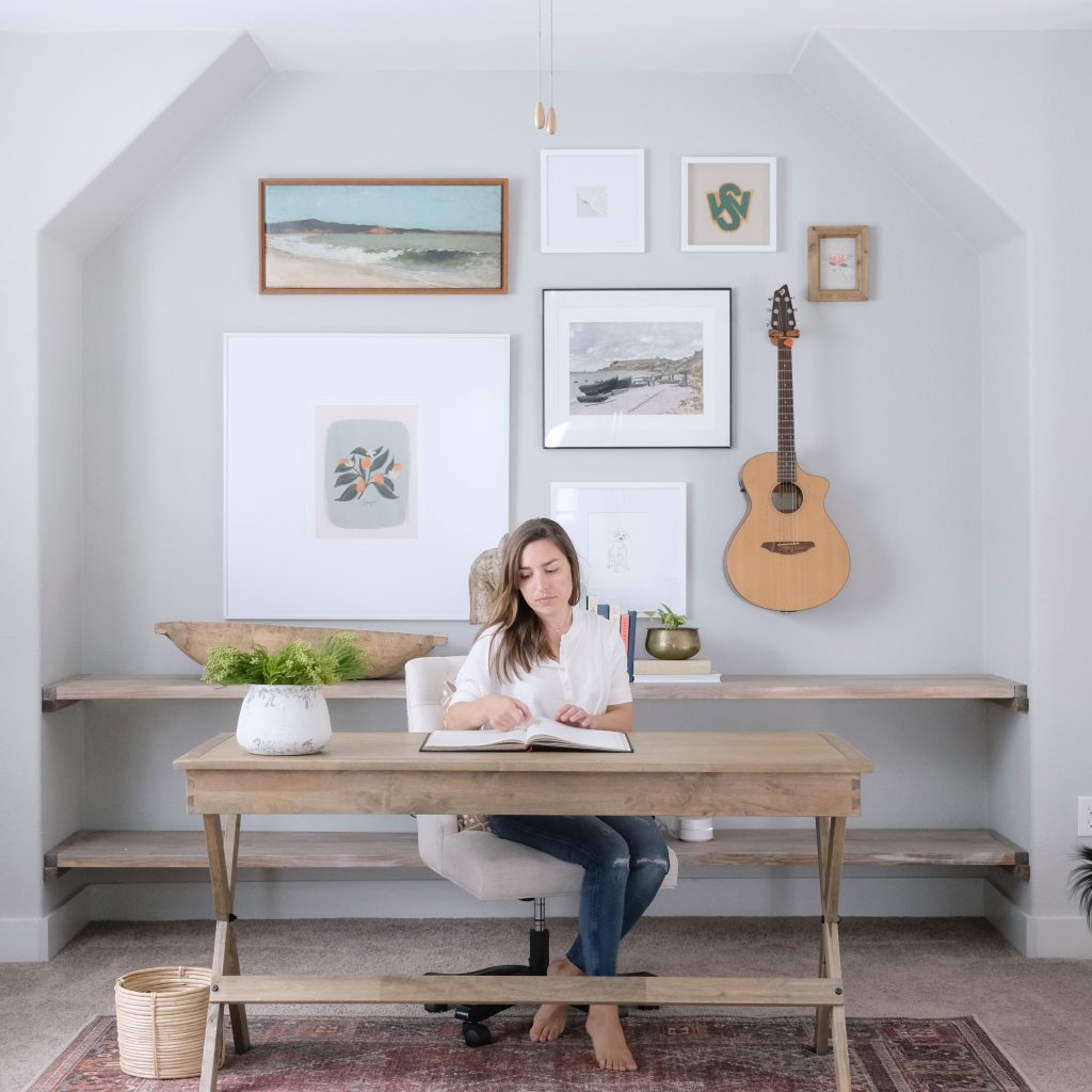
Walls: Dolphin Fin by Behr Paint, in Flat
Trim: Custom (See formulas at end of post)
Again, had I really thought about the lighting in this space, I probably would not have opted for a cooler-toned color. It often makes the space feel even darker to me and the green tones are very evident in this room. At the very least, I would have halved the color so that it wasn’t quite as saturated.
Guest Bathroom
Walls: Dolphin Fin by Behr Paint, in Flat
Trim: Custom (See formulas at end of post)
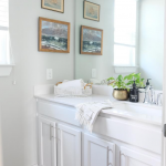
This room is tricky since half of it is bright and the other half (not shown) is blocked from light. Still, I like Dolphin Fin in here.

Guest Bedroom
Walls: Dolphin Fin by Behr Paint, in Flat
Trim: Custom (See formulas at end of post)
Since this is our guest room, I was going for something moody and cozy. I think Dolphin Fin does well to create that feeling and reads nicely since this room gets a decent amount of light.

Rec Room
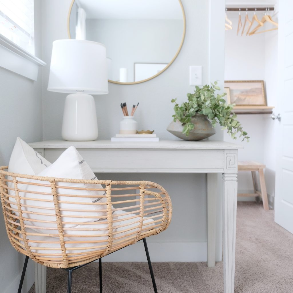
Walls: Custom (See formulas at end of post)
Trim: Custom (See formulas at end of post)
Console: Fossil Gray Chalk Paint by Behr (finished with Behr’s clear wax but I would suggest something more durable.)
The console color is one of my new favorite greys. It’s rich and warm but still very soft and versatile. It adheres well (I did not sand the console first) and has great coverage. You may not need as much as you think.

Custom Formulas:
As mentioned, many of the walls and trim in our home are painted in a custom formula by Sherwin Williams. I’ve shared those formulas below. Your local store should easily be able to recreate these colors for you. All walls listed as custom are Milestone High Hide White and all trim listed as custom Milestone Fog.

Let’s be friends! Follow me on Instagram @goldcoastcanvas for more home decor conversations.
Shop my house by following me here.

Related Posts
Restoration Hardware Cloud Sofa – Initial Review
My initial review of our RH Cloud Sofa…
September 28, 2022Guest Bathroom: Plans for our unplanned renovation
After discovering a major slab leak under our guest bathroom, we scrambled to make plans…
August 2, 20224 COMMENTS
Leave A Comment
This site uses Akismet to reduce spam. Learn how your comment data is processed.
© 2020 gold coast canvas. all rights reserved.










Tracy | 11th Sep 20
Do you have a link to the frame/photo above bed in guest bedroom?
admin | 11th Sep 20
Hi Tracy!
The frame is from pictureframes.com. It used to be called Smoky Bronze but I think they call it “Modern Bronze” now (see here.) It measures 40×14 with a 5×7 opening. I did not get the mat from them but I’m sure they could do a custom cut for you! Otherwise, it’s usually cheaper from Michael’s or a local frame shop. The print itself is a postcard from Etsy but there’s a print version of it here!
Let me know what else I can do to help.
best,
D
Caitlin | 13th Jun 19
Great info Dani! Love all of the serene colors in your home
Caitlin @ CaitlinMarieDesign.com
admin | 14th Jun 19
Thank you so much my friend. I learned a lot in this house! Can’t wait to try some new colors when we move