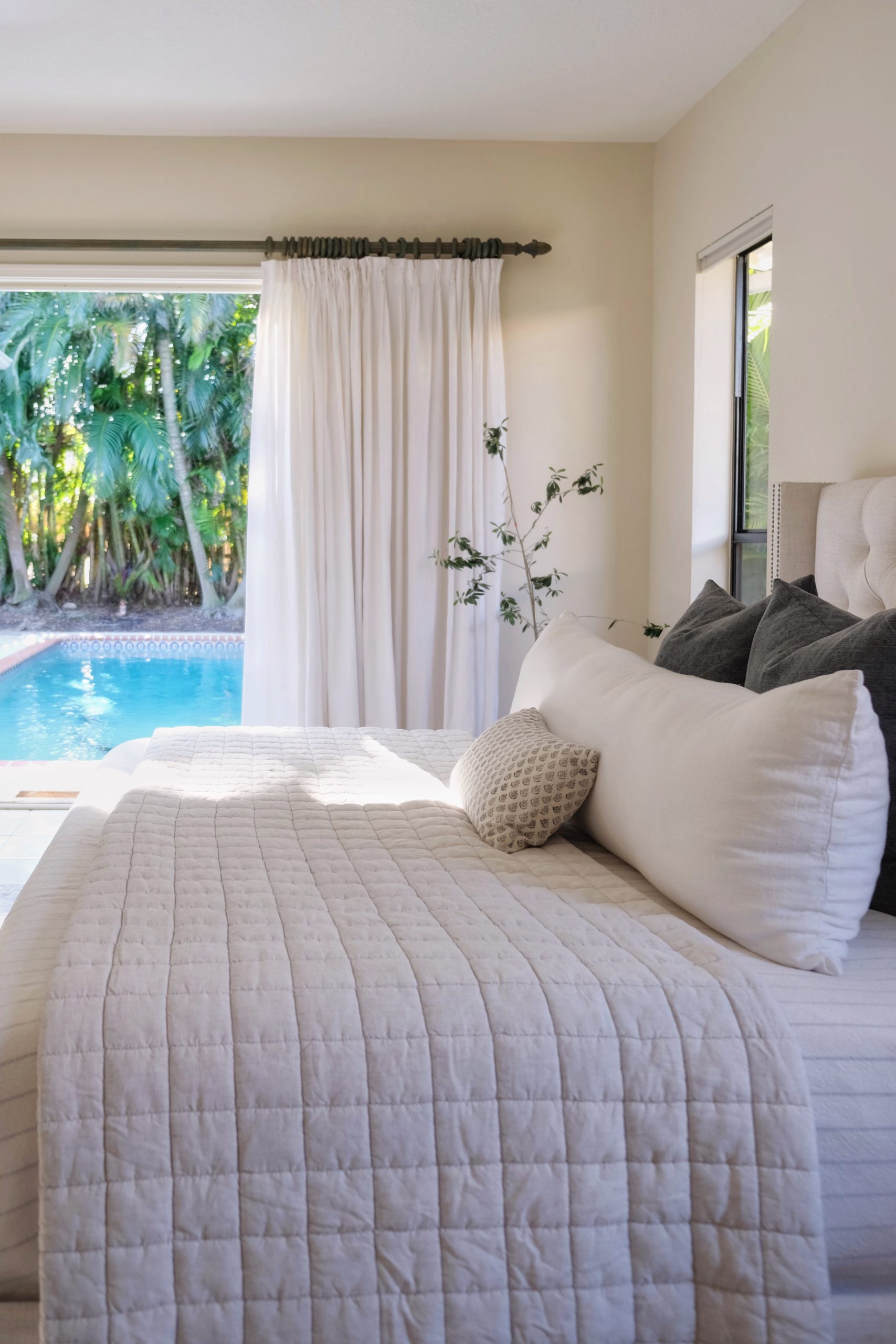
We didn’t originally plan on updating our bedroom right away. I still love everything we brought from the previous house. However, I’m finding that while the rest of the house is in shambles, I miss having a calm and tidy space to retreat to. While the bigger projects – like replacing all of the doors, windows and flooring – are a few years off, I decided to finish out the space with some simple upgrades.
The Space
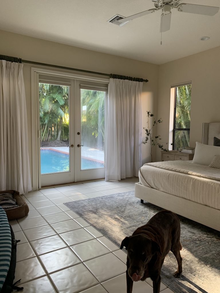
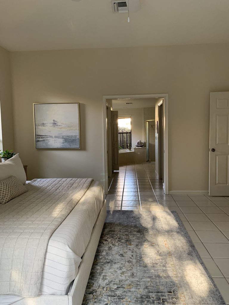
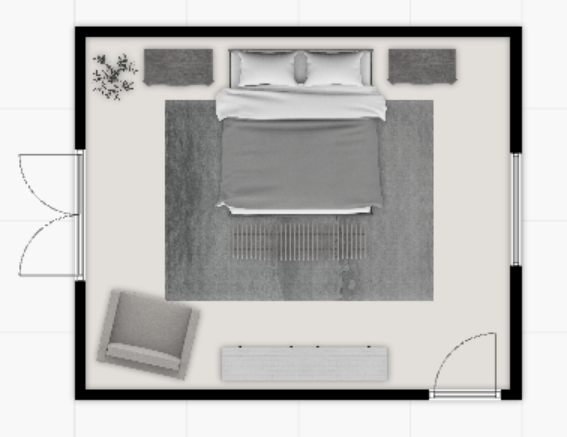
Our bedroom door is right off the entry which may be off-putting to some, but you do get a glimpse of the pool which is pretty nice. There is a set of French doors that open up directly to the pool and some tall windows that wrap around the side of the house. On the other side of the room, mirroring the French doors, is a double-wide doorway into our bathroom and closet area. (By the way, I have visions of this view in the future. So much potential!)
The Plan
While the rest of our home is getting drenched in moody colors and heavy textures, I wanted to keep things a bit breezier in our bedroom. It will still fit in with the rest of the house but will be decidedly softer on the eyes. Our living and gathering spaces may be relaxing, but I want our bedroom to be more than that. I want it to be restorative. To me, that means paying special attention to each of a bedroom’s functional zones and making sure they all encourage calmness and enable self-care.
This is the largest bedroom we’ve ever had, so I was careful in picking pieces that scaled properly. The goal is always to make a space feel full without filling it unnecessarily. Fewer, bigger things is one of my go-to design mantras.
Mood Board
Paint is a great way to set the mood in a space and we know how transformative it can be. I’ve decided to brave it and try my first ever Roman Clay application. I chose a simple, earthy off-white that will be elevated by the texture and movement that a Roman Clay application gives. It will be subtle and calming and a step above a plain white wall. Roman Clay applications are tedious but seemingly worth it. I’ll share all the details as I tackle the space.
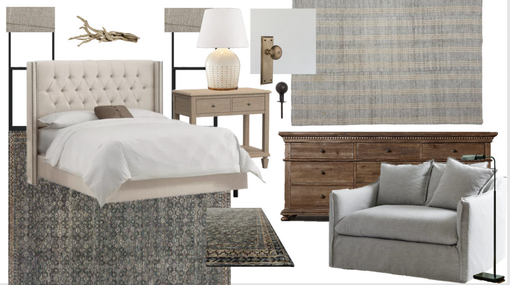
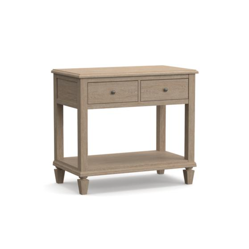
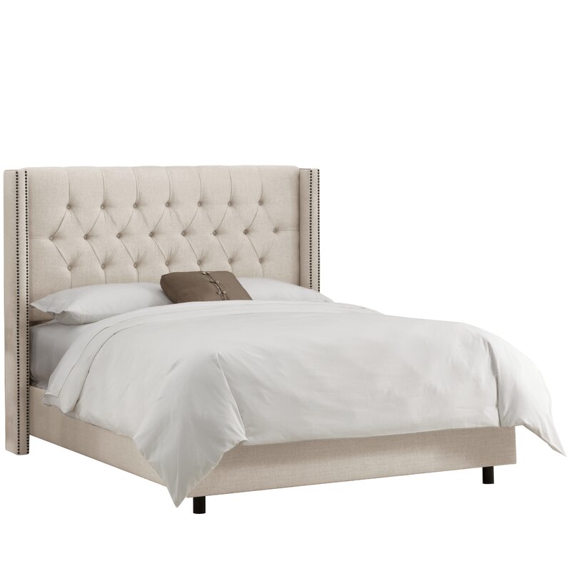
Contrast is one of my favorite design tools and decorating a breezy room is no exception. I’m keeping our existing linen bed and driftwood nightstands, but I’m swapping in a darker rug to ground the space and make everything pop. It’s slightly modern motif is balanced out by the faded black and inky blue accents throughout.
To avoid matching the nightstands too closely, I chose a dresser with similar traditional lines but in a darker, mid-tone oak. If you look closely, you’ll notice that the lines of the drawers, the top and the hardware and the weathered finishes are similar, but the pieces are still unique in their own right. This is a great trick for curating pieces from different collections or retailers. By the way, this mid-tone oak was my way of bridging the gap between the dark rug and light bed and nightstand. It helps make everything feel connected.
Above the dresser, I have something really cool planned. I’ll share the details soon! Next to it will be our chair-and-a-half in a dusty blue grey and the chicest little reading lamp in a bronze metal which plays off of our black window frames. I can’t wait to enjoy this corner.
Stay tuned for updates and watch the step-by-step unfold over on Instagram.
Sources


Looking for more? Subscribe below for my FREE Guide to Decorating
Related Posts
DIY Fireplace Makeover: From Old Stone to Lime Wash Perfection
We transformed our old stone fireplace into a simple modern Spanish dream…
May 4, 2021Vintage Frames for Every Budget
Vintage frames instantly add character to your walls. Here is a round-up of some…
March 24, 2021© 2020 gold coast canvas. all rights reserved.




Leave A Comment