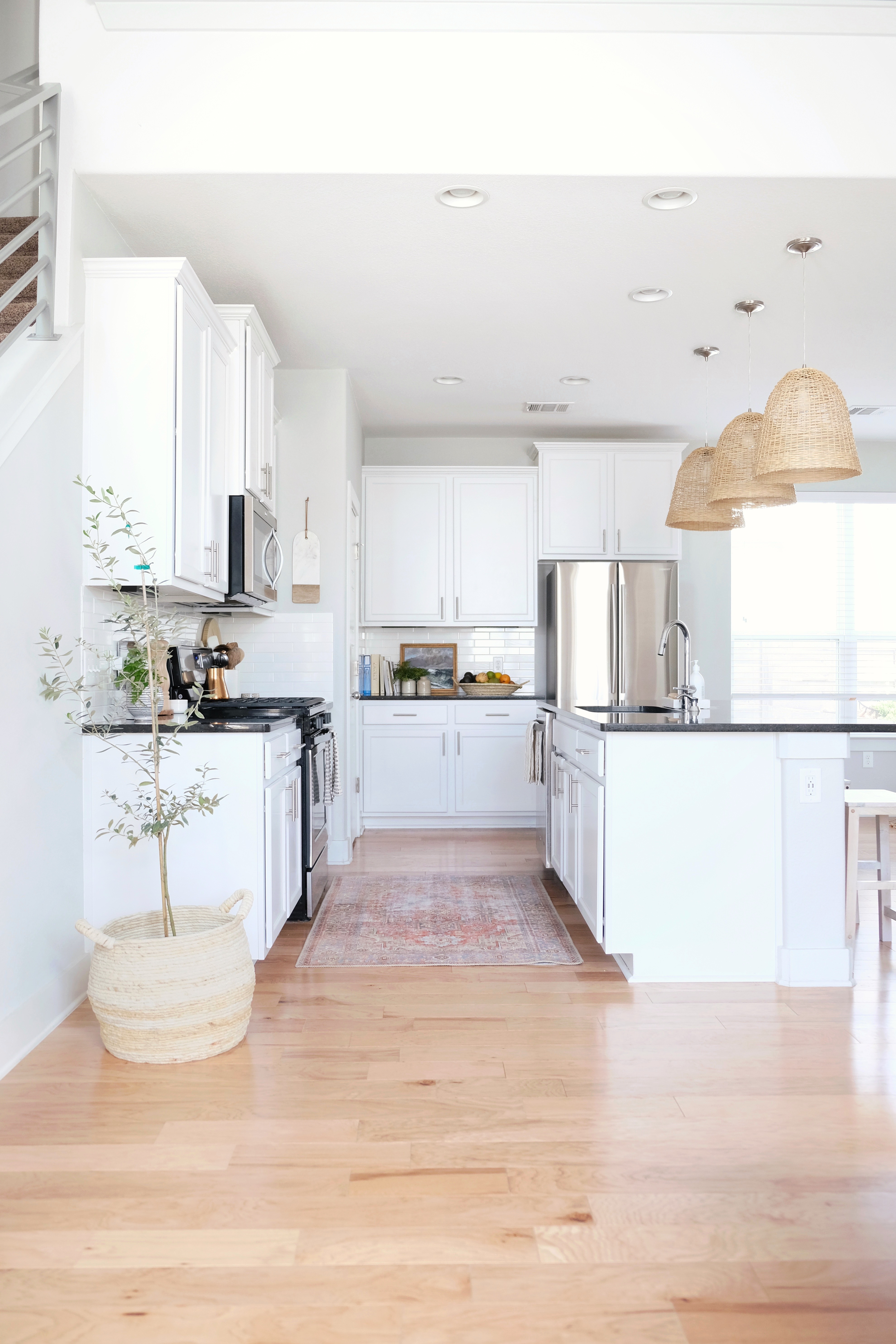
As serial renters, we’re used to cooking in less than ideal situations. When we moved into our latest rental – a modern, new-construction home with an open floor plan – the kitchen felt like a long-awaited luxury to us. Still, we felt that the modern fixtures needed some warming up. See how we transformed this kitchen into something homey and welcoming.
Disclosure: This post may contain affiliate links which could earn me a small commission if you buy something after clicking one. This doesn’t cost you anything and serves to support this site and all of the hard work that goes into it. Thank you for being part of this online neighborhood!
My dream kitchen feels warm, organic and minimal – full of natural materials and time-worn accents. In other words, a far cry from the modern black and white kitchen in our rental. But I knew that with a few thoughtful selections, I could make it work. Here’s how I made it our own:
The Perfect Warm Grey Paint
The very first thing we did was paint the kitchen area in Dolphin Fin, a warm grey by Behr. It gave the space some nice depth and made the white cabinets pop.
To shop: Hover over the photo and click the “+” icons for product sources.
Vintage Inspired Kitchen Rug
Then, I chose the perfect rug (here). It is a vintage-inspired flat weave rug by Loloi. It’s durable, doesn’t hold on to dirt and crumbs and is super easy to clean. Plus, it was an affordable way to change the the whole vibe of this space. The warm colors help bridge the contrast of the black and white while the vintage print tones down the hard modern edges in the room. It also helps bridge the gap between the warm floors and the cool, white cabinets.
Cabinets are 42” Armstrong Sienna Cabinets in Alpine White.
Here are some other flatweave rugs that will hold up well in dining and kitchen areas.

Kitchen Island Pendant Lights
The pendant lights (here) are another dramatic update that really changed this space. I knew I wanted a layer of natural warmth in this overhead space in order to balance out the rug. It creates a “design sandwich” as I like to call it – alternating vertical layers of warm, cool, warm, cool or color, neutral, color, neutral. The “design sandwich” helps keep the eye moving around the space while creating a sense of cohesiveness. (Ok, I’ll stop saying design sandwich now!)
Hover over photos and click “+” for sources
Since we can easily take our lighting fixtures with us, I picked some that we would enjoy here and in our future forever-home. I worked closely with Grace of My Bali Living to pick the perfect pendants. The shape is clean and structured while the hand-woven rattan adds that bit of organic warmth that I was going for.
Beverage Station
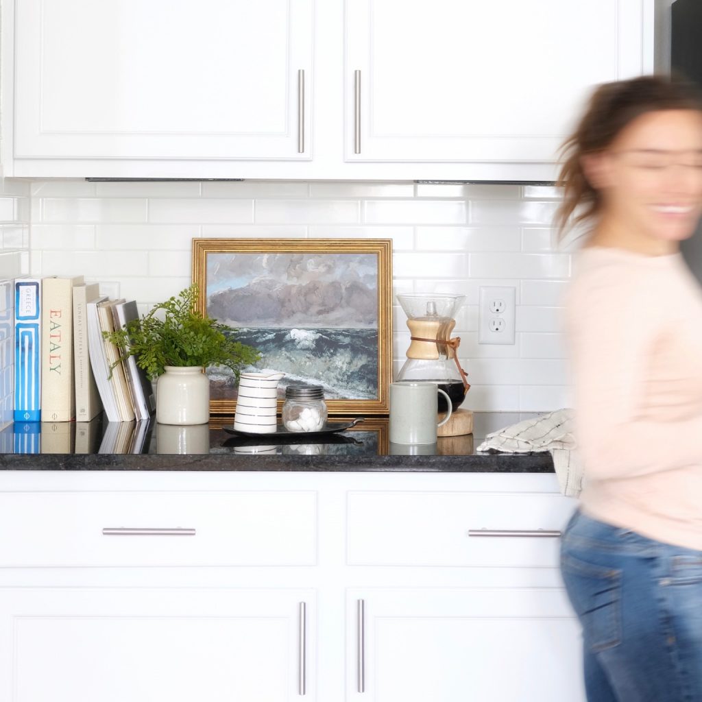
The area next to our fridge (here)was an obvious spot for a beverage station. The cabinets are stocked with all of our coffee and cocktail essentials making it really easy for us to host a gathering (or for guests to help themselves!)
Hover over photos and click “+” for sources
The vintage-inspired painting (here) with the gold frame pulls from the warmth of the rug and pendants while also adding a bit of old-world-charm to this new space. The small french crocks are vintage (similar here).
The green mugs are vintage Calvin Klein (selling on eBay here and similar here). Stoneware mugs are from Haven Comforts Co. (here and similar here and matching pitcher here)

Kitchen Island
Inevitably, the kitchen island became the center of our daily living. It is our breakfast bar, turned work station, turned catch-all for our bags, keys and mail when we get home. For that reason, I keep it completely clear except for a little marble tray (similar here) of necessities. Lately, I’ve really been into reducing waste in our home and these wood pot scrubbers (here and here) are a handy and beautiful alternative to sponges. [Read more here: 10 Easy & Stylish Swaps for a Reduced Waste Home]
Hover over photos and click “+” for sources
Everyday Items
I love this functional little nook by our stove. I stocked it with the things we reach for most. And because they are on display and used daily, I spent money on beautiful, quality items that we’ll love for years. (Except for the big cutting board – that is actually a cafe table top from Home Depot!)
The olive wood utensils are hand made from a shop on Etsy (here). As is the tiny dotted salt cellar (here, different size). The grey vase by Stephanie Charlene houses fresh herbs in water when we need to keep them perky for a day or two.
Hover over photos and click “+” for sources
Walk-in Kitchen Pantry
I joke that our pantry is my favorite room in the house but secretly, I think it’s not a joke at all! The front of the pantry (shown) houses all of our dry goods. The rest of the pantry extends the whole length of our stairs and offers a perfect storage spot for cleaning items, extra folding chairs etc.
We often buy from the grocery store bulk bins so I didn’t see any reason not to get pretty containers to put everything in. I’ve also found that keeping things organized increases the likelihood that we’ll actually use things instead of letting them get lost in the back of the shelves.
Hover over photos and click “+” for sources
Dining Room & Breakfast Nook all in one
Our dining room is relatively small but I insisted on buying the biggest table (here) we could fit. To make it work, we opted for benches instead of individual seats and pushed it up against the wall. It ended up creating this cozy little dining nook and we find ourselves spending many long meals here.
Hover over photos and click “+” for sources
The prints above the table are actually sketches of the various homes we’ve made memories in: Brad’s apartment in the northern beaches of Sydney, our 120 year old Victorian in San Francisco and the south St. Louis bungalow my dad grew up in.
Off of the dining room is a small hallway that leads to our bedroom, the laundry room and a half bath.
Laundry Room
In San Francisco, Brad and I became accustomed to the dirty chore of laundry. Whether it was schlepping to a laundromat or risking a house fire with the ancient machines in our landlord’s garage, laundry was never an enjoyable task. So darn it, I was going to make this one as pretty as possible!
Hover over photos and click “+” for sources
Since this was a bare bones room, we opted for front loaders (sold here) in order to give us some “counter space.” The vintage rug sets the mood and the woven baskets (here and here) warm everything up. The frames house old photos of my grandparents and they are so dear to me!

This pairing was inspired by Laine & Layne!
Half Bathroom
Half-baths are a great place to experiment and have a little fun with design. The rest of the house is pretty neutral, so when I saw this oversize canvas of ladies in swim caps, I knew it would be a great playful piece for this space. Again, I warmed things up with brass, wood and rattan.
Hover over photos and click “+” for sources
Adjoining Living Room
The view in our living room is about to change dramatically as we await delivery of our new sofa. I can’t wait for everyone to see it! Follow along on Instagram for all of the updates.

Shop the post


Related Posts
Dining Room Plans
We’re moving on to our dining room project! Brad and I both come from…
January 29, 2021Our New Home!
An entire year later, we are FINALLY in our new home. A wonderfully loved fixer…
December 23, 20203 COMMENTS
Leave A Comment
This site uses Akismet to reduce spam. Learn how your comment data is processed.
© 2020 gold coast canvas. all rights reserved.


Austin House | gold coast canvas | 2nd Jul 20
[…] more of our kitchen here. Find kitchen dimensions and material details here. Turn on your JavaScript to view […]
Melissa | 13th Nov 19
Hello. Maybe I missed it but do you know the color of the kitchen cabinets? Thank you!!
admin | 26th Nov 19
Hi Melissa! I’m so sorry I missed your questions. The cabinets are Armstrong Sienna Cabinets in Alpine White 🙂 Thanks for stopping by!!