Have you ever felt overwhelmed trying to piece together a living room that doesn’t look like it was just plucked off a showroom floor? These simple guidelines will help you get that curated look.
Choose Similar Heights
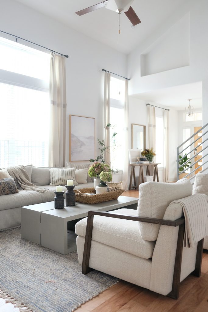
Both your seat and back heights should be fairly consistent across all of your seating. Having similar seat heights ensures comfortable conversation and that everyone has the same vantage point for the television if there is one. Sticking to similar seat back heights helps pieces feel cohesive.

product sources
Balance The Legs
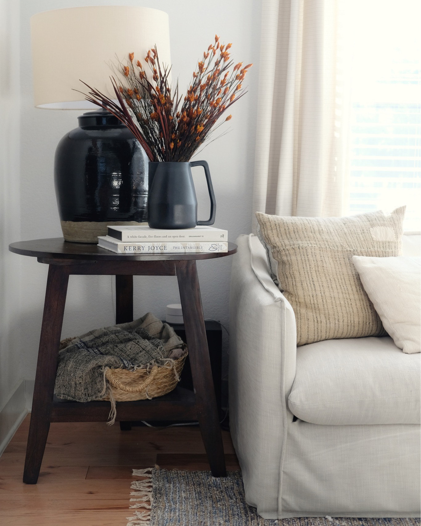
If you have lots of solid furniture without space underneath it, try mixing in a few “leggier” pieces to visually lighten the space. If a sofa reaches the ground, I typically like choosing a coffee table with legs or open space underneath. It’s the same in reverse as well. If your room is “too leggy” it can come across as busy or cheap. Try mixing in some solid pieces like a stump side table or a skirted sofa.
Choose Contrasting Fabrics & Materials
Instead of trying to match your materials and fabrics (which can be very hard to do when mixing furniture) opt for contrasting colors instead! For example, a grey sofa would pair nicely with white accent chairs and a black metal coffee table. Alternatively, a creamy linen sectional would look great with a woven jute ottoman and cognac leather accent chairs.

Play with Shapes
If everything in your space is square and angular, you’ll want to soften things up with a few round pieces like a round side table or lamp. The same is true in the inverse. If you have a sectional couch, for example, you’ll likely find that a round coffee table helps break up all of the angles and allows for easier movement around tight corners.

product sources
Keep It In The Family
The style family that is! There is absolutely room to mix style genres, but as a general guide, it’s best to keep the majority of your pieces from the same style family. If your choices tend to lean mid-century modern, then you’ll want about 90% of your furniture choices to fall within that category. Then, for the other 10%, accent with other styles that you love and you’ll give your room a curated look without it feeling confused.
Keep it To Scale
Did you know that filling a room with furniture can actually make it feel bigger? If you match the scale of your furniture to your space, you should be able to fit all of the pieces you need for comfortable living.
But what exactly does that mean? How do you choose the right scale? The “Golden Ratio” is 1:1:6 and often applied to design and decorating scenarios. In simpler terms, the bulk of your living room furniture (sofa, coffee table, accent chairs) should fill about 2/3 of the space. Any more than that, then it’s likely your furniture is too big. Any less than that, and it’s likely that it’s too small!

On the vertical plane, rooms with taller ceilings can handle taller furniture while low-profile furniture can sometimes help a small room feel more grand.
Looking for More?
Check out this post [here] on layering a room.
Let’s be neighbors! Follow me on Instagram @goldcoastcanvas for more home decor conversations.

Related Posts
Affordable Curtains: Three Options
Though it never gets very cold here in Palm Beach, I still enjoy swapping in…
November 16, 20204 Rug & Sofa Pairings to Elevate Your Living Room
I find myself dreaming up pretty sofa and rug combinations for our next home. When…
September 21, 2020© 2020 gold coast canvas. all rights reserved.


Leave A Comment