One Room Challenge Week 3: Choosing a Paint Color
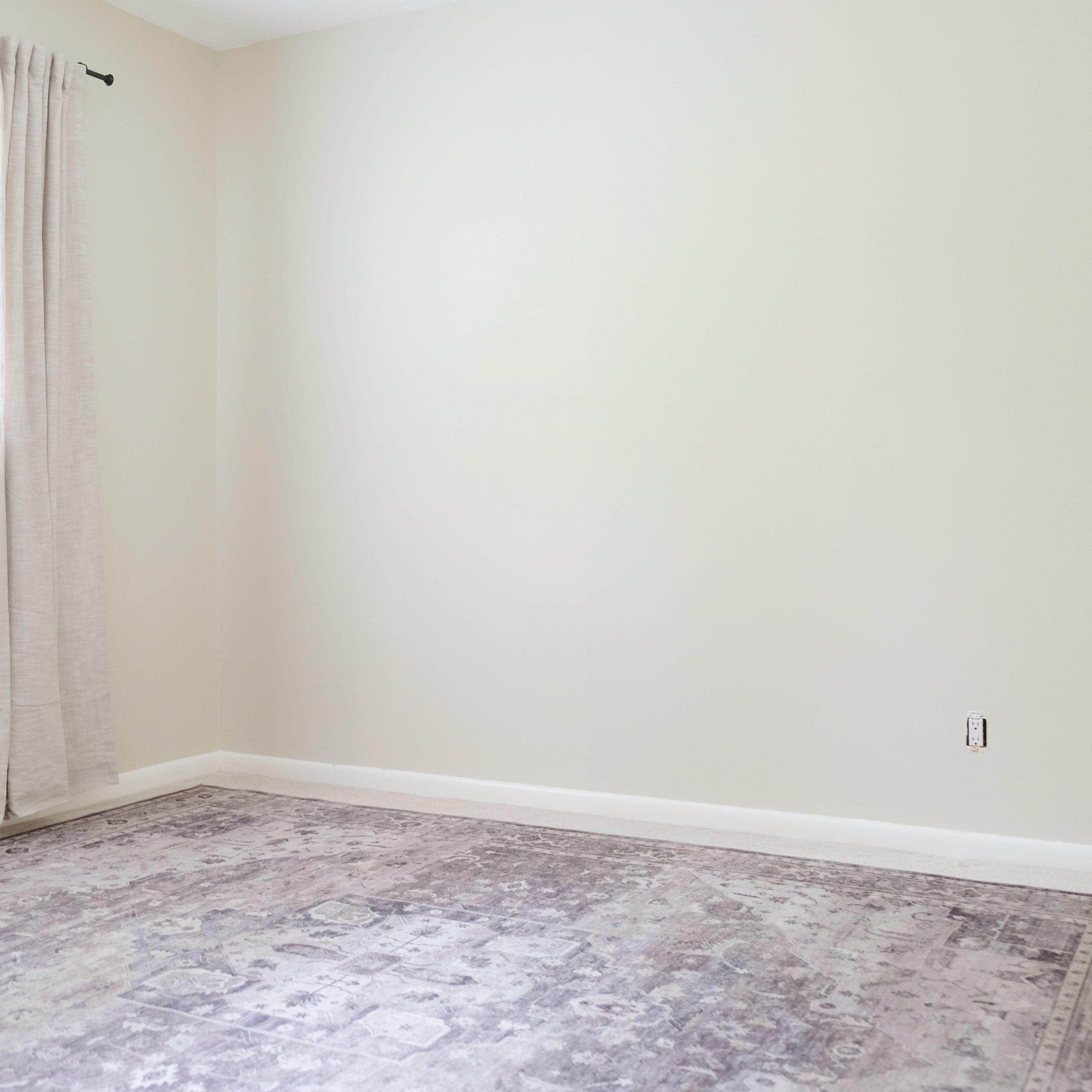
For this Spring’s One Room Challenge, I’ll be redoing a bedroom in my Mother-in-Law’s house! I have six weeks to totally transform the room and I’ll post design updates each week here on the blog and on Instagram. To view my previous ORC updates, click here. To view other participant transformations, check out the ORC website here: www.oneroomchallenge.com/orc-blog

Choose Paint Last
In my previous post, I walked you through my design process and explained why I typically choose paint last in a space. Now that most of my pieces for the room have been delivered, I was able to test out several paint colors and easily determine which worked best. Here are a few guidelines I follow for narrowing it down:
Paint is Not Necessarily About Color
Paint is used to give a space dimension and to evoke certain moods. Before settling on a color, think about how you’d like the room to feel. Our One Room Challenge room has many functions since it’s really the only space that’s ours while we build the new house. I really want it to feel serene and quiet, but it’s also my office so I’d like it to have a little vibrancy to it.
To me, that means I need a color that is soft but that has lots of warmth so that it comes to life in the daylight. For this room, I chose Neutral White by Sherwin Williams. It plays as a soft gray in the evening but a nice, sunny taupe during the day.
Room Size
This room is fairly small (roughly 10′ x 11′) and smaller spaces tend to benefit from color that has some depth to it. What gives a color depth? Any color that has grey or black in it. That could be anything from a moody blue to a pale grey or even a soft, shadowy white like the one I chose. We tend to see black and grey as negative space which visually makes the walls recede into the background and appear further away than they are. On the other hand, really stark, flat colors like bright whites can draw attention to the walls and shrink a space. Spaces that are already large can handle these colors much better.
Natural Light
In my experience, rooms that get lots of natural light can handle both cool and warm toned colors. They can also handle both light and dark colors (just be careful that your dark color choice doesn’t look washed out in bright space.)
On the other hand, I tend to think that spaces that get little to no natural light almost always look better in warm-toned colors, since cool-toned colors can come off as “sickly” looking when there isn’t enough natural light to liven them up. Colors with a little bit of pigment to them look best in rooms with less natural light. A true white, for example, can look fairly drab in a dark room.
Our room doesn’t get a ton of natural light so I chose a really soft white with warm grey undertones.

Rooms within Rooms
If you have a large closet, bathroom or hallway attached to a room, you can create the illusion of distance and depth by painting the smaller space a slightly darker shade. I chose a darker hue for our closet and I love the way it came out!
When choosing additional shades for the same space, be sure they share similar undertones so that it feels cohesive. Both of these colors are neutral (i.e. they don’t have any significant undertones) and both are slightly warm.

Accent Walls
I get requests for help with accent walls often. My general response is this: accent walls work well if they are for the purpose of highlighting an architectural feature (like built-ins) or if there is a natural architectural divide between it and the rest of the walls around it (like our closet.) Color alone does not really add enough interest to a wall to make it look purposeful. If you have four similar walls that lack architectural uniqueness and you paint one a different color, it could end up looking abrupt and unnatural.
Often times, we can create the interest we crave without using paint at all! If you have a big blank wall, instead of painting it in an accent color, think about using large scale art or an oversize headboard (which is what I chose to do in our room.) In other areas of the house, like the dining room, you could choose a show-stopping light fixture over the table to act as the object of interest instead of the wall itself.
Choosing A Paint Finish
There are typically five levels of sheen (also known as finishes) to choose from: Flat/Matte, Eggshell, Satin, Semi-Gloss and High Gloss. Flat has no sheen while High Gloss is the shiniest. Glossier finishes are more durable and are great for high-traffic and wet areas like a bathroom.
Glossier finishes also reflect more light so, in darker spaces, you might consider something with more sheen to help bounce more light around the room. For this reason, I tested a satin finish in our space. However, I didn’t feel that the Neutral White had enough pigment – the reflection off the paint just washed it all out – so I ended up going with an eggshell finish. Eggshell still reflects significantly more light than a flat finish so it worked great. I love the way it turned out!

Let’s be neighbors! Follow me on Instagram @goldcoastcanvas for more home decor conversations.
Related Posts
Affordable Curtains: Three Options
Though it never gets very cold here in Palm Beach, I still enjoy swapping in…
November 16, 2020Thanksgiving Table Favorites
Thanksgiving may look a little different for us this year, but it’s the little…
November 9, 20202 COMMENTS
Leave A Comment
This site uses Akismet to reduce spam. Learn how your comment data is processed.
© 2020 gold coast canvas. all rights reserved.


Our Borrowed Bedroom Reveal | gold coast canvas | 9th Sep 20
[…] a bit of warmth and pigment to it. (You can read more about how to choose the right paint color here!) For the furniture and decor, I decided to stick with a tonal palette and focus on amping up the […]
One Room Challenge Week 4: Furniture is here! | gold coast canvas | 1st Jun 20
[…] my previous post, I walked you through my approach to choosing a paint color. I finished painting just in time for […]