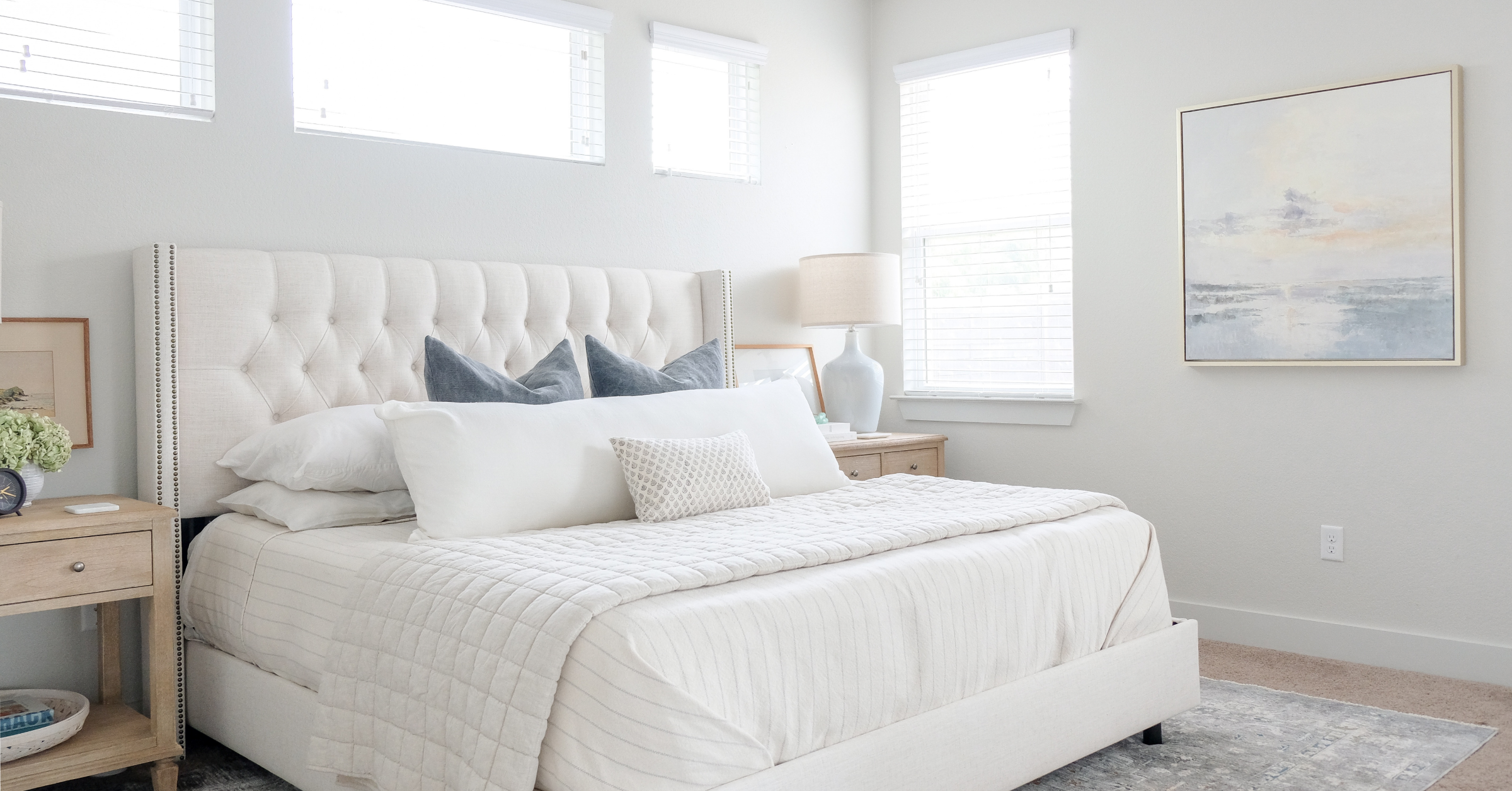
After two years of curating pieces for our master bedroom, the day is finally here. It’s complete!
Disclosure: This post may contain affiliate links which could earn me a small commission if you buy something after clicking one. This doesn’t cost you anything and serves to support this site and all of the hard work that goes into it. Thank you for being part of this online neighborhood!
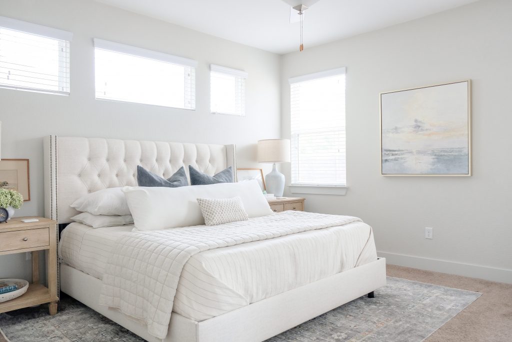
I am not a patient person. I am a true Millennial in that I love instant gratification. But I know from past mistakes that the most well-designed rooms don’t come together overnight. I exercised some self-restraint and spent almost two years putting this room together. Will it change a bit when we move out of this rental? I’m sure. But I absolutely love it right now. Like, “my-heart-sings-every-time-I-walk-into-the-room” kind of love. So here is the grand tour!
Overall, I wanted the room to feel clean, calm and casual with, as always, subtle nods to life on the coast. So let’s start with the bed. It sets the foundation for the whole room, so it needed to be a good one. I totally took a chance on this linen tufted bed from Overstock and it paid off. Not only is it sturdy, the linen is way more beautiful in person. It’s a great fabric and it has just the right undertones that make it easy to mix with just about anything.
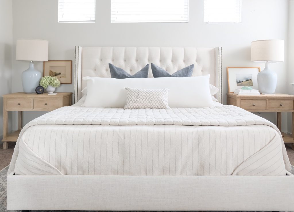
The bedding took me a while to get right. I knew I wanted something that leaned casual with lots of texture and tonal combinations. I always choose white sheets – they are easy to clean – but I got more creative with the upper layers. I chose this woven pinstripe blanket from Evangeline linens in Classic Grey for a rugged look and subtle pop of pattern. (You can also find the Navy Stripe version here.)
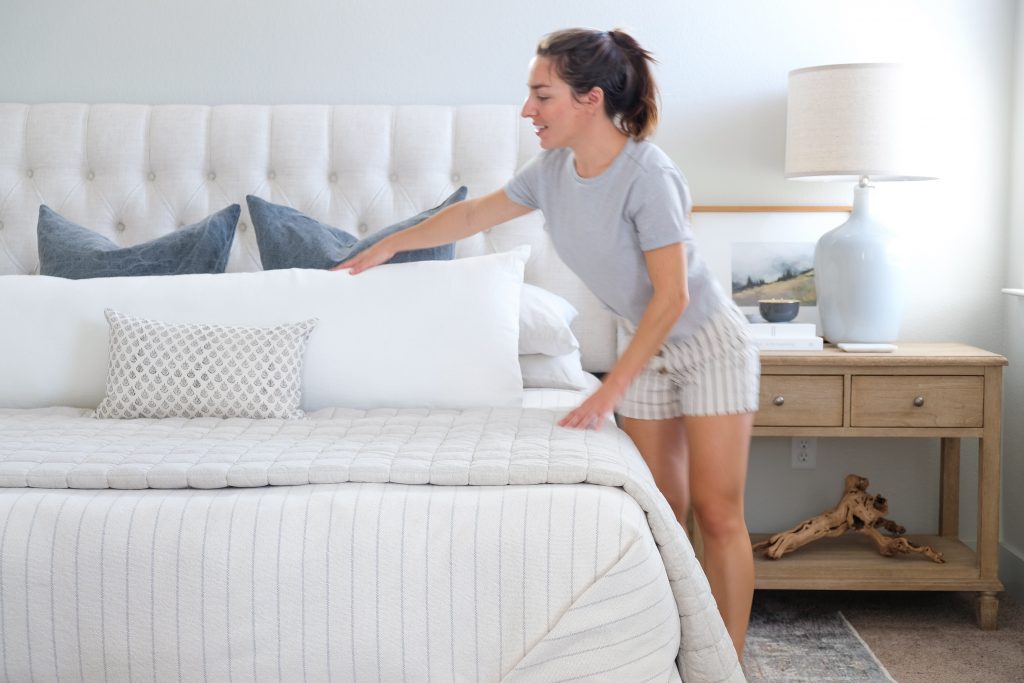
Layered at the foot of the bed is this Belgian Linen quilt from West Elm. I chose the flax color for tone-on-tone look against the striped bed blanket and the quilting adds some visual height and interest. My other option was a thinner blue quilt but I took a poll on Instagram and most of you agreed that this one was the winner!
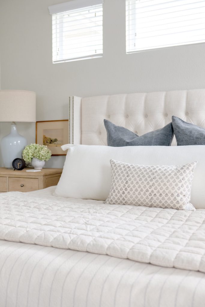
I experimented with pillows a few times before I chose these dusty indigo jute covers from McGee & Co. The muted color and aged details seem so relaxed to me. Just the look I was going for. And because I love a super full looking bed, I chose this giant body pillow for the middle layer. It is heavy and huge and so awesome. I put it in front of the blue pillows because I wanted the blue to be an accent color, not the focal point. Plus, it’s unexpected and I like that. (The cover can be found here in off-white and the insert here.) To top it off, I chose this beautiful unique cover from The Estate of Things on Etsy. It ties in the blue, greys and beiges perfectly and is subtle enough that the pattern doesn’t feel too ornate for the otherwise simple space.
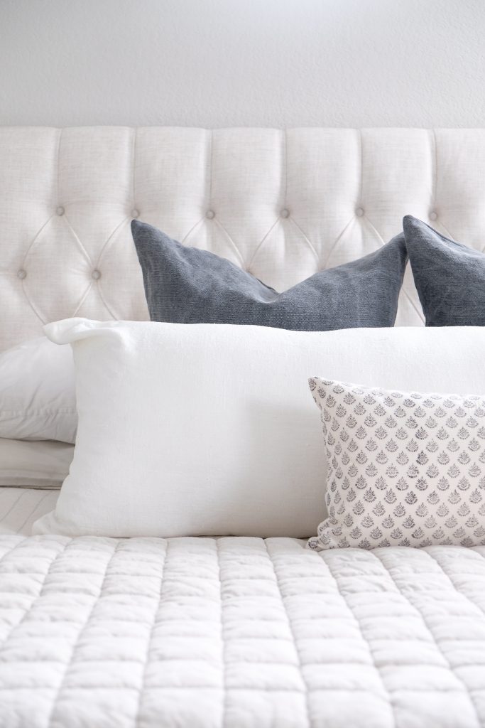
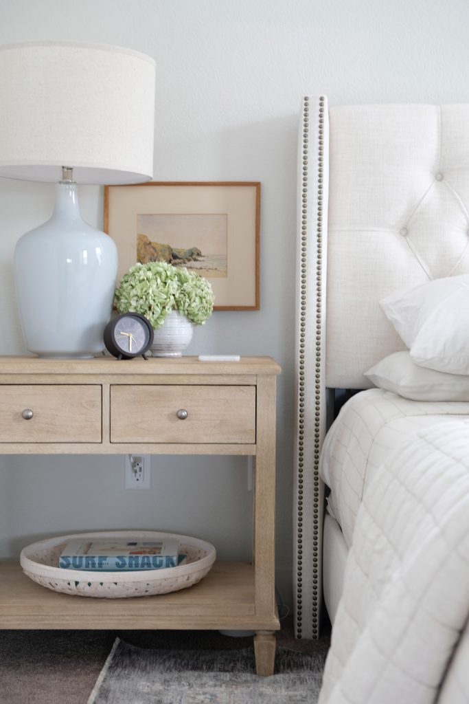
These bedside tables from Pottery Barn are still one of my favorite purchases to date. I love a sizable nightstand (roughly at least half the height and width of your headboard) and these are great. The open bottom and weathered finish keep it feeling light and airy. I topped them with these oversized bluish/greyish lamps to tie in with the rest of the room.
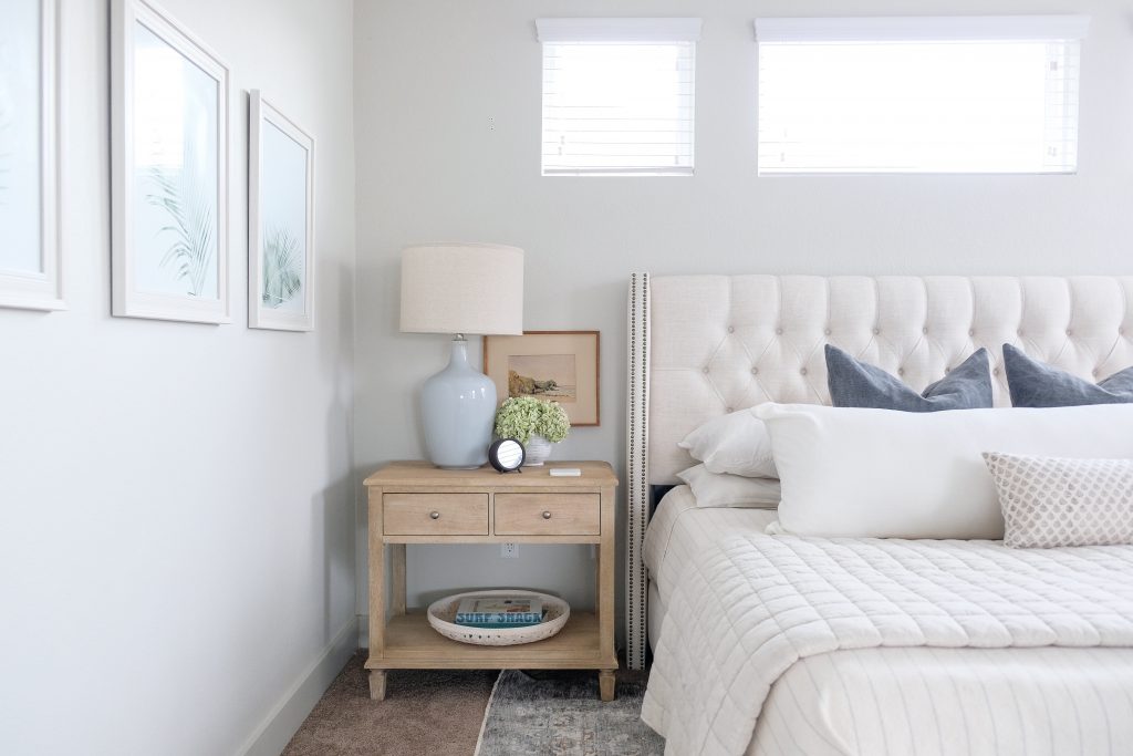
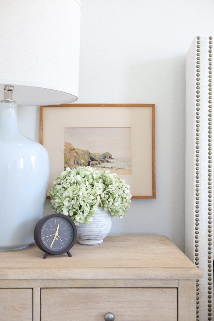
Brad’s table is topped with a vintage watercolor painting framed in a wood that offers a nice warm contrast to its surroundings. And did you know that hydrangeas dry out very nicely? Especially green hydrangeas. These are real and have been here for months. The vase can be found here, the clock here and the books and basket here, here and here.
Now to my side of the bed. To replicate the look of the vintage watercolor painting, I purchased a Sarah Nightingale print and gallery frame in the same warm colors. To match the cleanliness of the white mat, I topped the table with these beautiful white books (here and here.) Plus some bright yet subtle pops of metal with this candle (a DIY) and ring dish. Similar driftwood pieces can be found here or here.
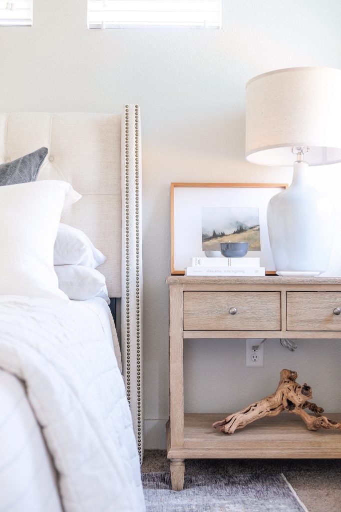
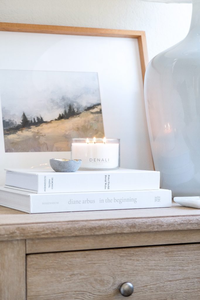
Frame // Print // Ring Dish // In The Beginning // How To Work Better // Denali Candle (Use GOLDCOAST20 for 20% off
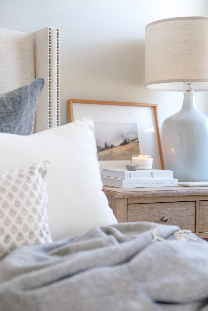
Frame // Print // Ring Dish // In The Beginning // How To Work Better // Denali Candle (Use GOLDCOAST20 for 20% off // Grey Alpaca Throw
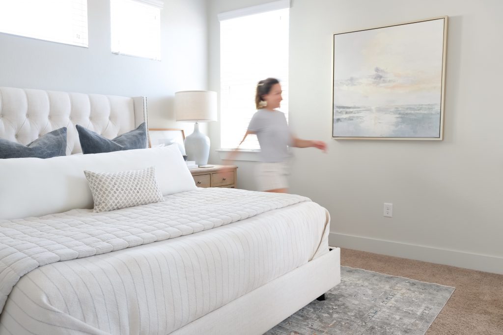
And let’s not forget the pieces that tie this whole room together. The beautiful Surya rug (which is oh so soft) really transformed the entire space. I originally went with a neutral jute rug but, in addition to it’s weird yellow tint, it didn’t contrast enough with it’s surroundings to really ground the space. The other big-impact piece was this beautiful abstract beach painting. Coastal decor can quickly become kitschy if you’re too literal with it. Abstract art is a great way to introduce the “feeling” of the coast without being too overt with it.
The walls are Silver Drop by Behr. This color was in the grey family but, in this room, it reads a very warm white. At certain times in the day, this room just glows with sunshine and I love it!
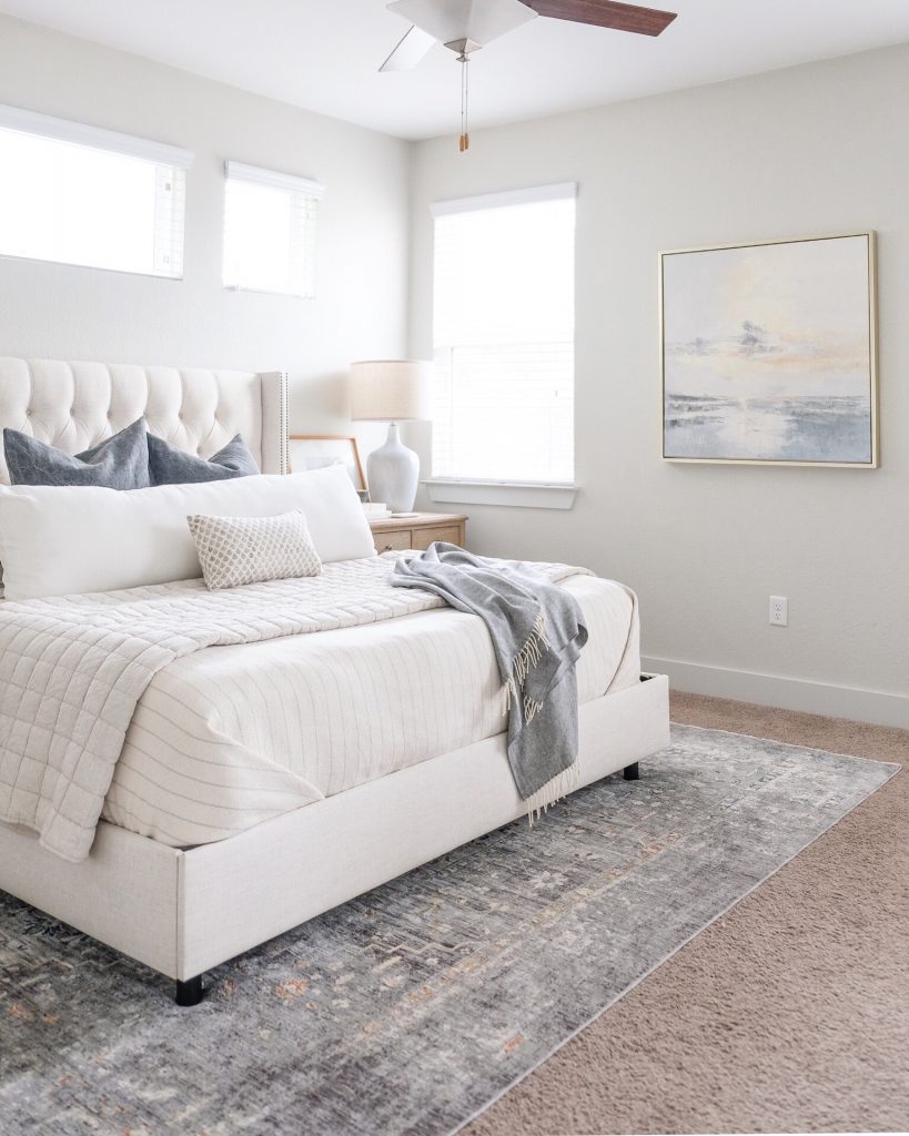
Bed // Stripe Blanket // Quilt // Blue Pillows // Body Pillow Cover // Body Pillow Insert // Rug // Wall Art // Bedside Table // Lamp
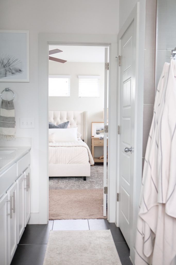
shop the post

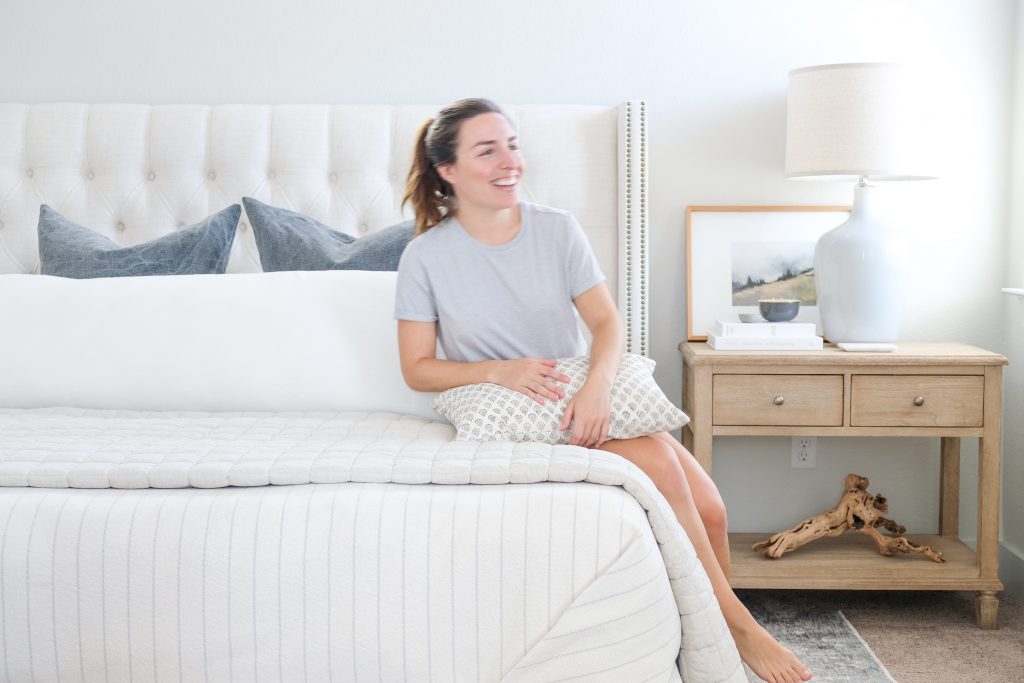
Questions? Leave me a comment or find me on Instagram and let’s connect!

Related Posts
Our New Home!
An entire year later, we are FINALLY in our new home. A wonderfully loved fixer…
December 23, 2020Our Borrowed Bedroom Reveal
Eight months later and we finally have an update on our next home…
September 9, 20205 COMMENTS
Leave A Comment
This site uses Akismet to reduce spam. Learn how your comment data is processed.
© 2020 gold coast canvas. all rights reserved.


Our Austin Home: Sources for our previous rental | gold coast canvas | 8th Aug 20
[…] more of our bedroom here. Turn on your JavaScript to view […]
Diana | 25th Apr 20
love it ! Can you tell me what size the body pillow is ?)
admin | 3rd May 20
Thanks so much, Diana! It’s a 20×60″ (shown on a King size bed.) Let me know if I can do anything else to help!
Heather | 30th Sep 19
Love everything! Which size did you get the bed in?
admin | 30th Sep 19
Hi Heather,
Thank you so very much! I appreciate that. Our bed is a King 🙂
Best,
Dani