Since there are a million and one ways to style an entryway, I thought I’d work backwards. Here are my answers to five entryway styling challenges:
1 | Not sure where to start?
A standard entry formula looks a little something like this:
rug + table or bench + mirror or art + lighting
Build in that order. Then layer in your functional items: baskets, key dishes, wall hooks, etc. Finally, add in your decorative touches: photos, candles, books and other decorative objects.


2 | Feeling cluttered?
The first purpose of a formal entryway is mainly aesthetic. It’s meant to give you space to enter your home and it sets the tone for the rest of the house. Trays, boxes, baskets and walls hooks are all perfect entryway additions, but trying to make your entry into a space that accommodates everything can invite clutter. For this reason, I usually advise clients to pick just 2 or 3 main functions to prioritize.

Once you choose your functional priorities, pare down your items to find that balance between function and style. The goal here is to give the space enough function without enabling it as a dump zone. In our house, reducing the chances for clutter was especially important because the entry is visible from almost every space on the main floor.

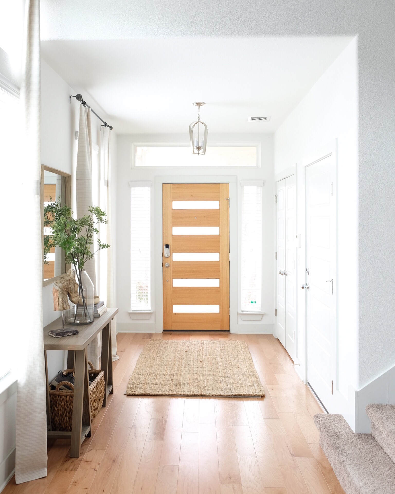
For our space, I wanted three main functional items: a mirror for last-minute checks as I headed out the door, a small bowl to throw our keys in and a stool (which has storage in it – bonus!) I also threw in a pretty doorstop which we use to keep our garage door open when unloading the car. Everything else is tucked away in our coat closet or right inside the garage door which we use more often anyways. It does require some extra restraint but it also feels really good to have a place in the house that is always in order.


3 | But, wait! What if I don’t have a formal entryway?
You’re not alone! I’ve lived in several places that had little to no entry space. In some, I was able to carve out a defined space with a small rug and great lighting. In others, I had to make use of my wall space with mirrors, hooks, wall lighting and floating shelves. If you have the floor space, a great stool or chair can triple as decor, a seat and a surface to set things down on. Since you only need one, this is a great time to splurge on something amazing or to use that lone vintage piece you spotted at a thrift store. If your entry opens directly into your living room, your sofa console or media console might also double as an entry table.
Here are some great small entry options:

4 | Ok, now how do I style it?
First order of business, make sure your decor is big enough! Often times, we choose pieces that are just too small for a space. Make sure your rug really fills the entryway and that you are anchoring your space with appropriately sized furniture and styling pieces. If a vignette is feeling unfinished – even with a multitude of items – it could be because the items chosen are just too small. Pick just a few large scale pieces to style with first. You can always go back and fill things in with the smaller pieces.

The vignette below is anchored by one very large-scale item: the vase and stems which are almost the height of the table itself. It’s complimented by a tall horse figure and the smallest item, the bowl, is “bulked” up by anchoring it with several large books.


5 | Got it. Now how do I fill my console table?
Again, make sure you’re choosing pieces that are large enough. As mentioned, this will help things feels proportional, reduce visual clutter and allow you to decorate with fewer items (i.e. less money!)


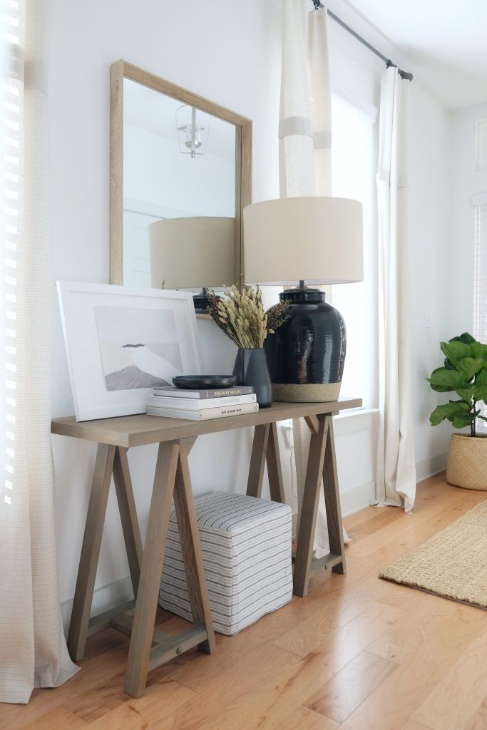
I like to ensure that I’m choosing items in a variety of heights and materials. Then I alternate these throughout the vignette for plenty of visual interest. I love putting contrasting materials next to one another to make each one pop.

For visual balance, use objects of varying heights to create triangles (i.e. a taller object flanked by slightly shorter objects.)
Quick Tip: Have you noticed that when vases are sold in pairs, the smaller one is always about 2/3’s the size of the larger one? Here are some examples:

Interesting, right? This proportion finds the balance between creating variation while maintaining cohesion. It can be visually more pleasing to the eye this way. So if things are feeling a bit disjointed, try rearranging them so that the size difference between adjacent objects is a bit more connected and creates those visual triangles.

There you have it! What else do you want to know about entryway styling?
Did you know? You can visit the Shop section from my home page to shop some of my favorite picks!
Follow me on Instagram for more decor inspo!
Related Posts
Fall Bedding: Layer by Layer
Though it never gets very cold here in Palm Beach, I still enjoy swapping in…
October 27, 20204 Rug & Sofa Pairings to Elevate Your Living Room
I find myself dreaming up pretty sofa and rug combinations for our next home. When…
September 21, 2020© 2020 gold coast canvas. all rights reserved.


Leave A Comment